Empower members to
file their taxes
My Role: Lead Designer
Team(s): 5 PMs, countless engineers, research partner
Timeline: 2+ Years
I led experimentation and product design for Credit Karma’s tax surface focused on helping users to understand their taxes and feel empowered to file. My work included ideating new UX patterns, designing experiment flows, and running iterative tests across multiple cohorts.
I collaborated closely with engineers and product to rapidly prototype, test, and ship high-CTR insights-based features that laddered up to our broader strategy: turn tax anxiety into confident action.
I led the design and rollout of five key experience areas:
1. Advanced Refund Estimator
2. Document Checklist
3. Refund Priorities
4. ADP-Powered Insights
5. A ton of Experiments
The Setup
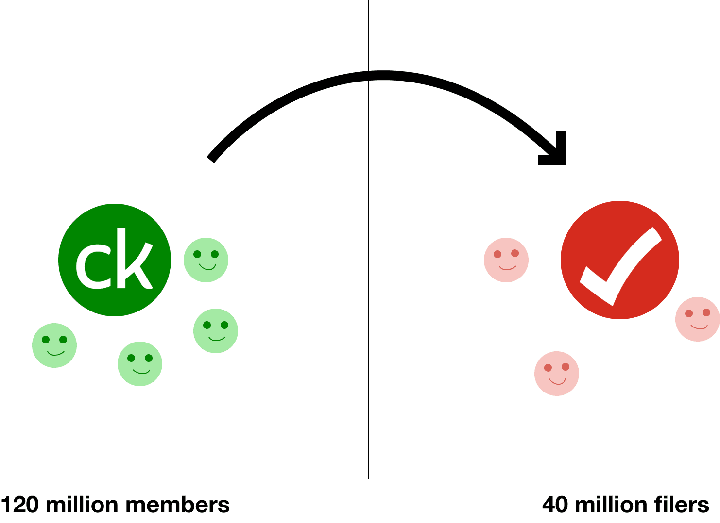
As a Lead Designer embedded with Credit Karma’s tax team, I was responsible for shaping the tax surface experience, a critical vertical that sees millions of users during tax season and serves as one of the company’s most strategically important entry points.
Following Intuit’s acquisition of Credit Karma, a major initiative began:
Use CK’s 120 million–strong user base to drive high-intent filers into TurboTax.

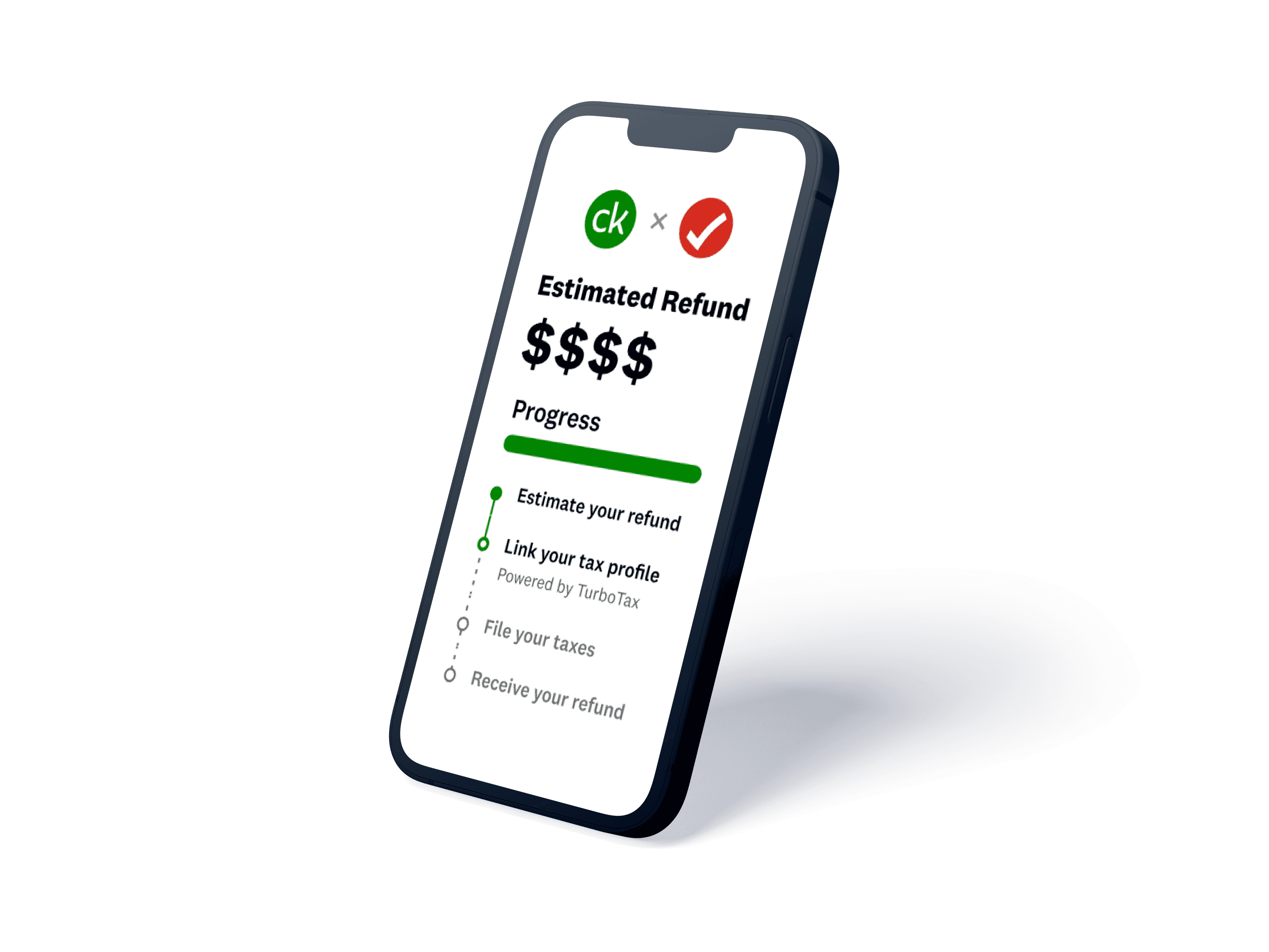
Advanced Refund Estimator
We rebuilt Credit Karma’s flagship estimator into a 20+ screen guided flow that was clear calm, and surprisingly motivating. A front door to CK’s entire tax ecosystem.
my role
- Designed 20+ flow screens with smart defaults and inline validation
-Simplified edge cases across filing types
-Allowed more complicated filers to get a tax picture
-Partnered with legal, tax, and eng to ship quickly and accurately
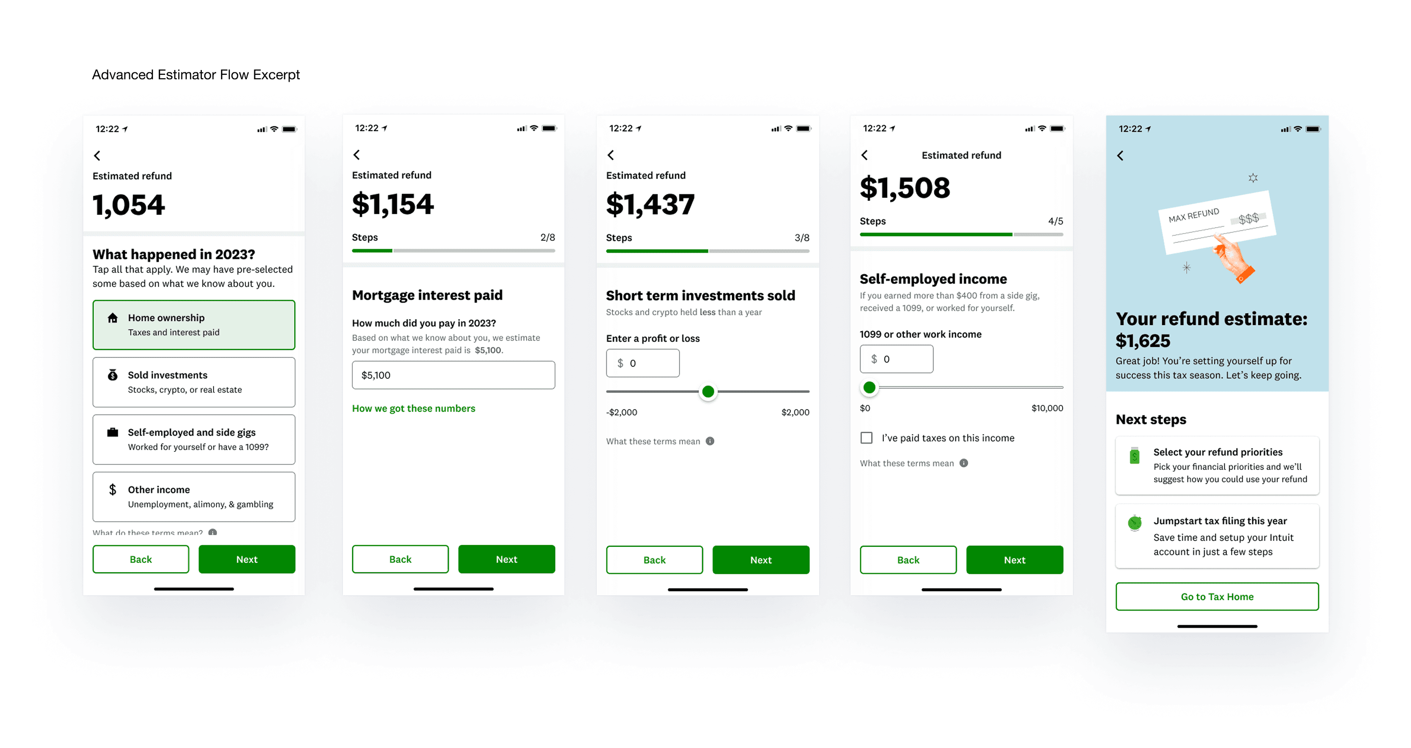
🚀 Results
✦ 5.6 million unique views
✦ 2.9 million completions
✦ One of CK’s top tax funnel entries
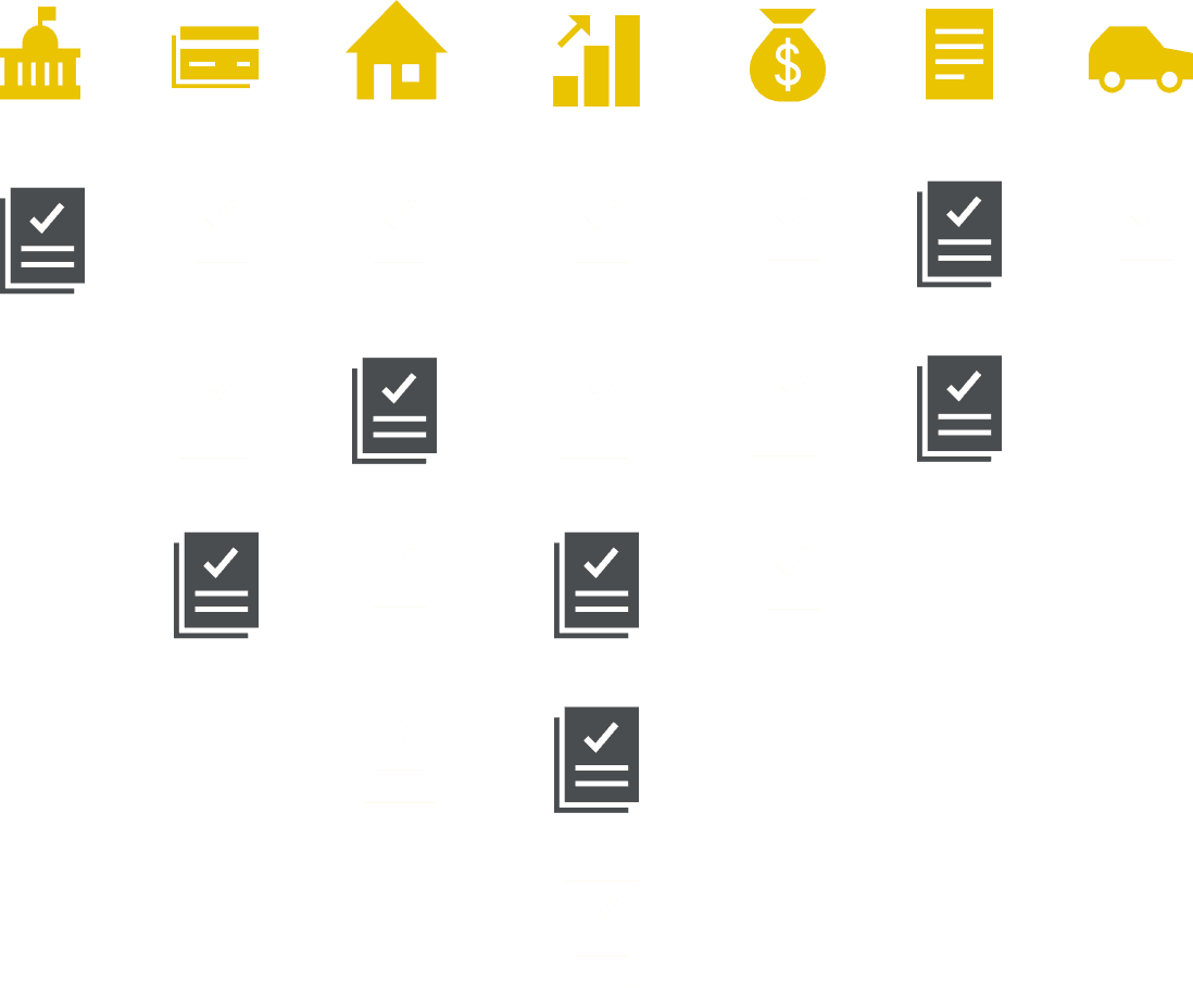
Document Checklist
For many users, starting taxes isn’t about complexity, it’s about inertia. So we designed a friendly, visual checklist to break that.
What we built:
- Lightweight card UI showing common docs (W2, 1099, etc.)
- Visual reinforcement of what you already have
- Letting members know when to expect their forms
✶ The insight:
People don’t need all the paperwork to start.They just need to believe they’re not behind.
Designed to make users feel like they were already in motion
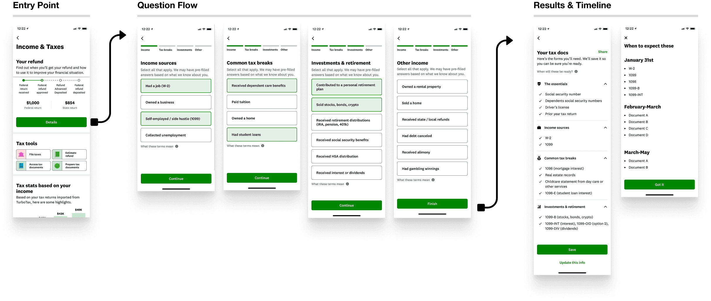
🚀 Results
✦ 300k unique views
✦ 100k+ completions
✦ A lot of prepared members
Refund Priorities
Getting money back is great. Knowing what to do with it is better. We created a smart, playful recommendation engine that kicked in after users filed.
It suggested what to do with your refund: save it, pay down debt, or build credit based on your behavior.
What I designed:
Lightweight, card-based modules
Logic-driven UI for targeting based on member profile
A/B tested messaging, icons, and CTA positions
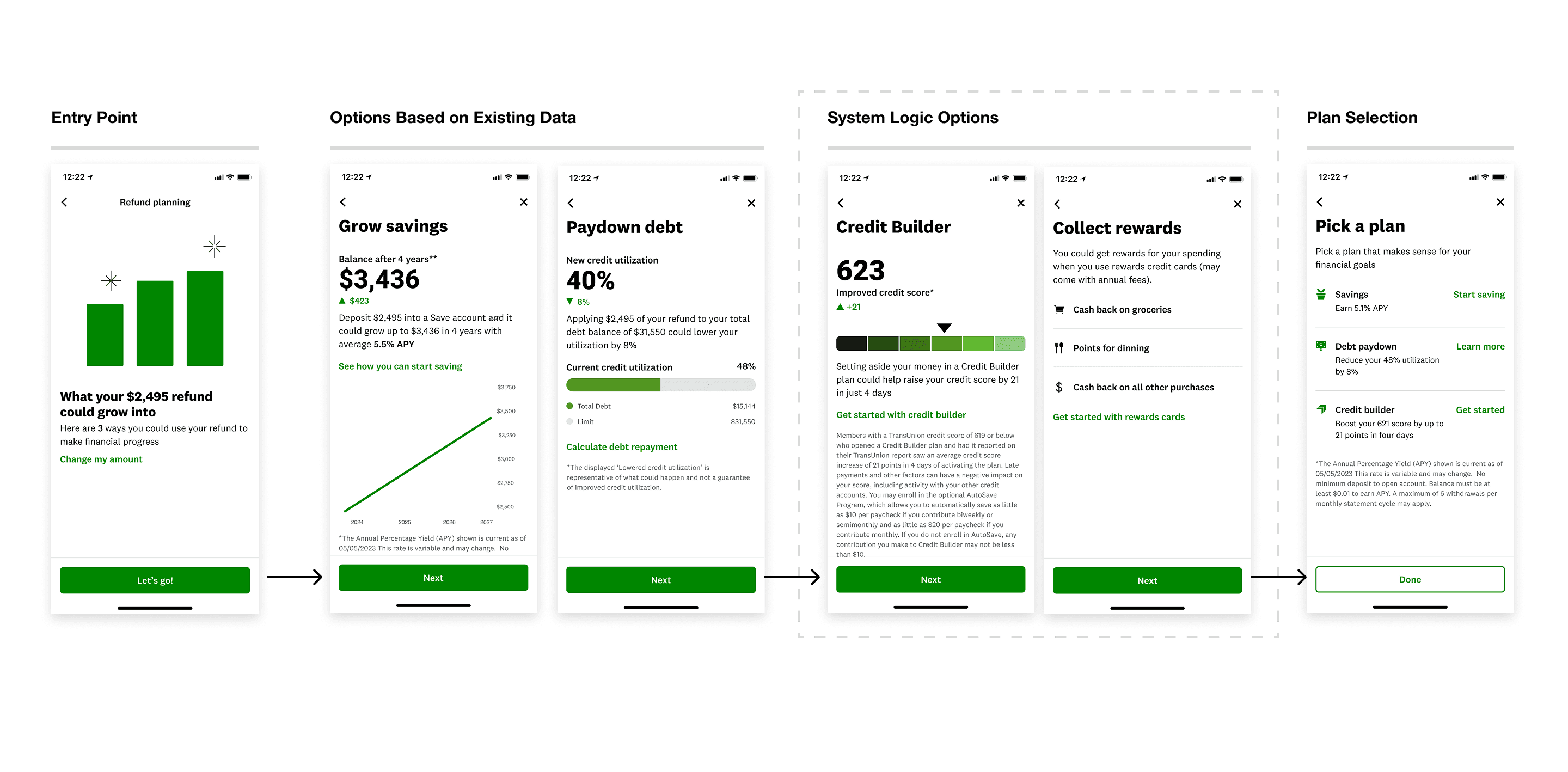
🚀 Results
✦ Helped reposition CK from a filing tool → to a financial guide
✦ 22-34% sustained CTR across multiple weeks
✦ Many legal lessons learned on money claims one can make
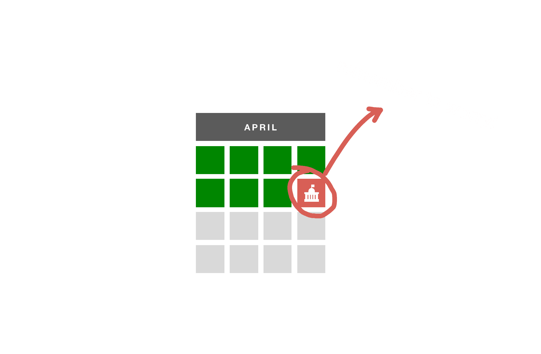
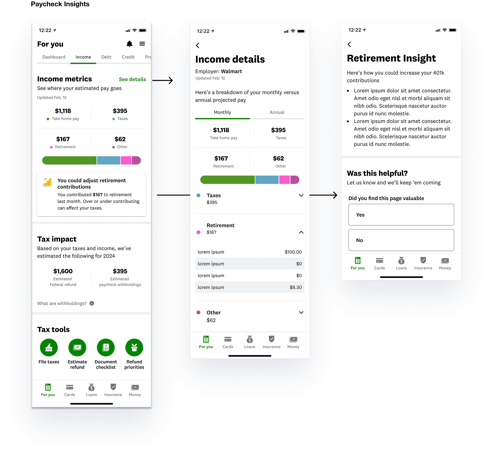
Paycheck Insights
The problem wasn’t just procrastination, it was a lack of reason for members to act early.
So we used ADP payroll data to surface lightweight, behaviorally-timed insights that helped users make smarter tax moves before April 15 hit.
No full flows. No invasive forms. Just a quiet signal:
“You might want to look at this.”
What I Designed
Contextual insight cards triggered off paycheck data
Messages that felt early, relevant, and non-intrusive
Clear opt-outs and data transparency built in from the start
How It Worked
If a user’s paycheck showed unusually high withholding, they’d see a soft nudge:
“You may be overpaying taxes check your estimate”
If multiple jobs were detected:
“Your refund might be lower than expected. Let’s take a look.”
What Made It Work
• Messages were surfaced outside of tax flows, in feed, on home, or via soft notifications
• The copy was suggestive, not directive, more “curious heads-up” than “urgent alert”
• The signal felt earned—because the data was already there
Testing what made people click, hesitate, or bail.
Before we committed to any one flow, we committed to learning. We ran dozens of experiments across surfaces, messages, and entry points to figure out what actually moved users to start filing.
The question wasn’t “Which button works?”
It was “What kind of emotional framing makes someone finally take action?”
What We Explored:
• Literal vs playful tone
• Urgency vs curiosity
• CK vs TurboTax brand positioning
• Refund-first vs feature-first framing
• Dashboard vs modal vs in-flow placements
• Dashboard vs modal vs in-flow placements
“We ran over 100+ variant tests across multiple user surfaces. This is a blurred snapshot of our variant tracking dashboard showing how I helped structure hypotheses, metrics, and cross-functional alignment.”
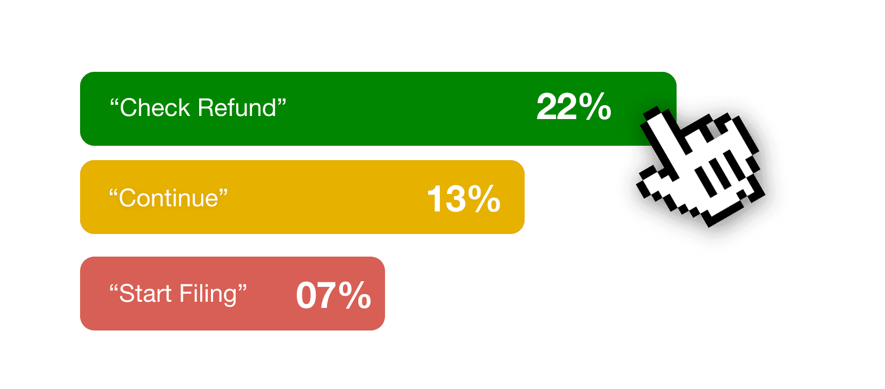
What We Learned:
“Check your refund” outperformed “Start your taxes” by more than 3x
Curious language consistently beat directive language
Users didn’t want to “file," they wanted to “see,” “check,” or “know”
We weren’t optimizing buttons.
We were shaping the emotional threshold for saying yes.
Why It Mattered:
These learnings informed everything that followed.
From how we framed the Estimator to the tone of post-filing nudges—each flow was built on signal, not instinct.