Web Assembly for Devs
Role: Lead Interaction Designer
Team: CTO, 1 PM, 3 designers, founding engineers
Timeline: 3 months
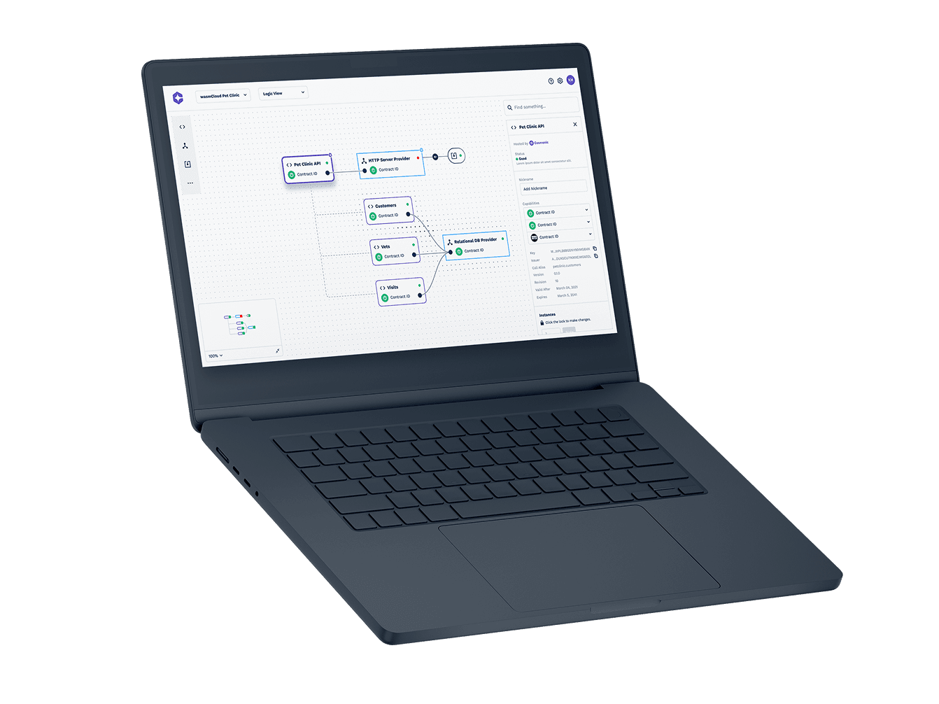
I led the design of Cosmonic’s end-to-end developer experience across information architecture, onboarding, and first-time user experience. While I collaborated closely with another senior designer on broader platform direction, I owned the design for the constellation editor—translating backend logic into an approachable visual interface.
Working with the CTO and founding team, I helped shape the overall interaction model and UI grammar. My focus was making a highly technical system feel usable and intuitive, grounding the experience in familiar mental models and scaffolding.
The Setup
Cosmonic is a platform-as-a-service (PaaS) startup helping developers deploy WebAssembly applications at scale. Their core technology was powerful but required deep technical fluency and comfort with the command line.
The Problem
Most WebAssembly PaaS platforms were fast but difficult to use and geared toward command-line experts with little visual guidance. Cosmonic set out to change that by redesigning their developer tools into an intuitive, end-to-end visual experience.
The Goal
Transform wasmCloud from command lines and coding into an elegant visual editor, enabling businesses and developers with varying levels of technical proficiency to swiftly translate ideas into fully functional applications.
Research & Workshops
We ran workshops to understand how to surface core system concepts like Actors, Providers, Hosts, and Links.
I mapped the relationships between them and explored how users might visually traverse and interact with them, like a constellation of services.
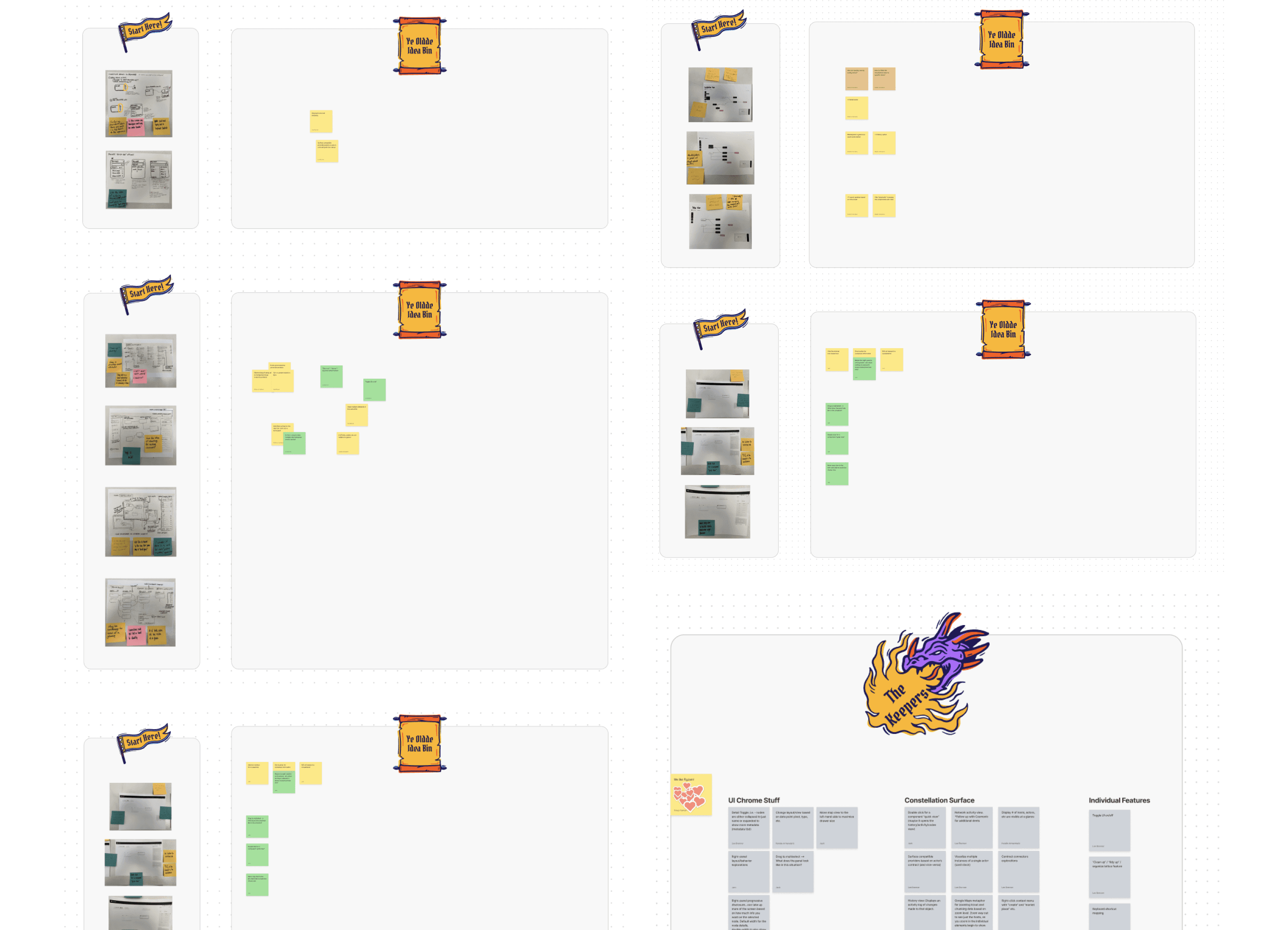
I diagrammed application states, connection types, zoom levels, and node behaviors. This let us isolate complexity and create layers of abstraction based on user needs.
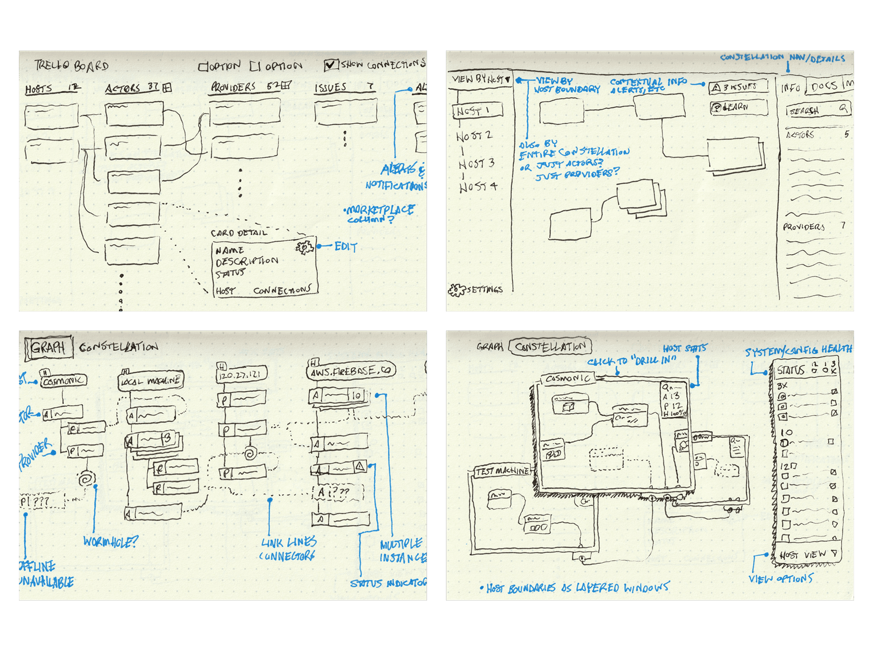
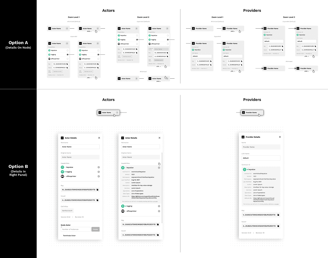
Design Decision
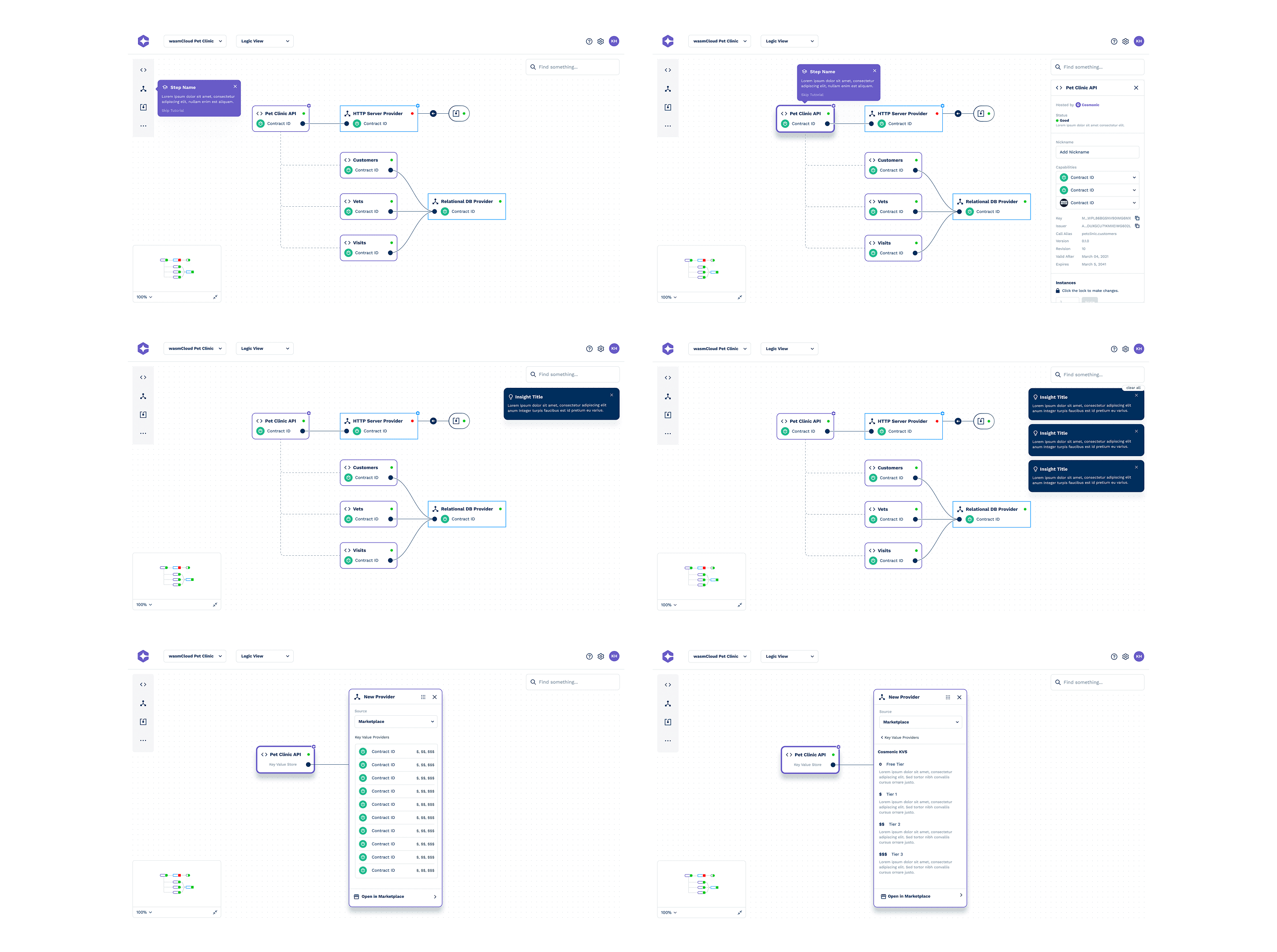
One major decision was whether to show all node types and details at once or progressively reveal complexity through zoom levels. We chose a hybrid approach: minimal detail upfront, with deeper context revealed via panel toggles. This helped reduce initial overwhelm while still supporting advanced use cases.
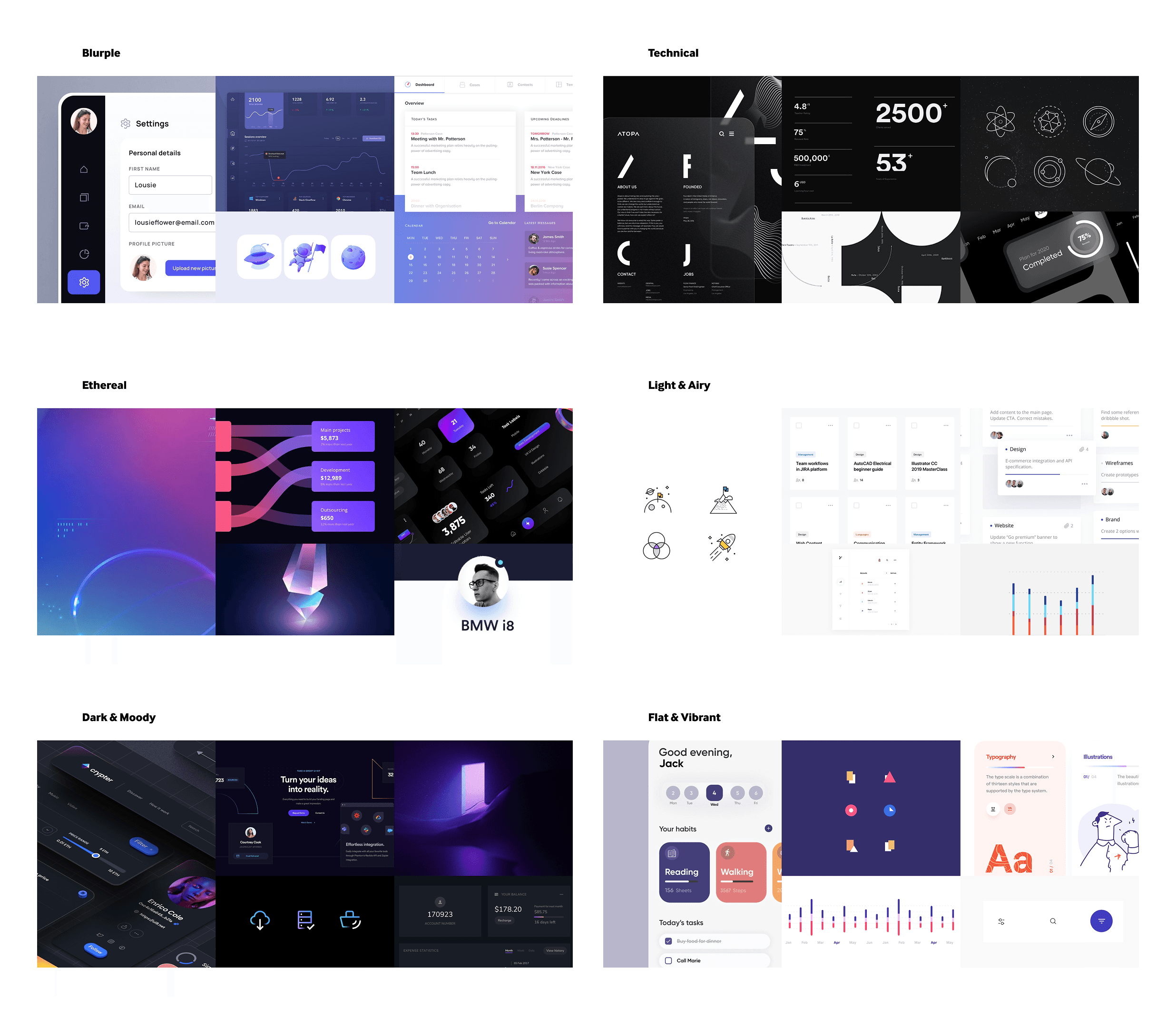
Moodboards
To anchor the interface visually, we explored multiple aesthetics from technical and sharp to ethereal and soft. We aligned on a direction that balanced professionalism with creative expressiveness.
We explored multiple directions for how interface elements might behave testing grouping logic, connection styles, and interaction patterns to support visual clarity and scalability.
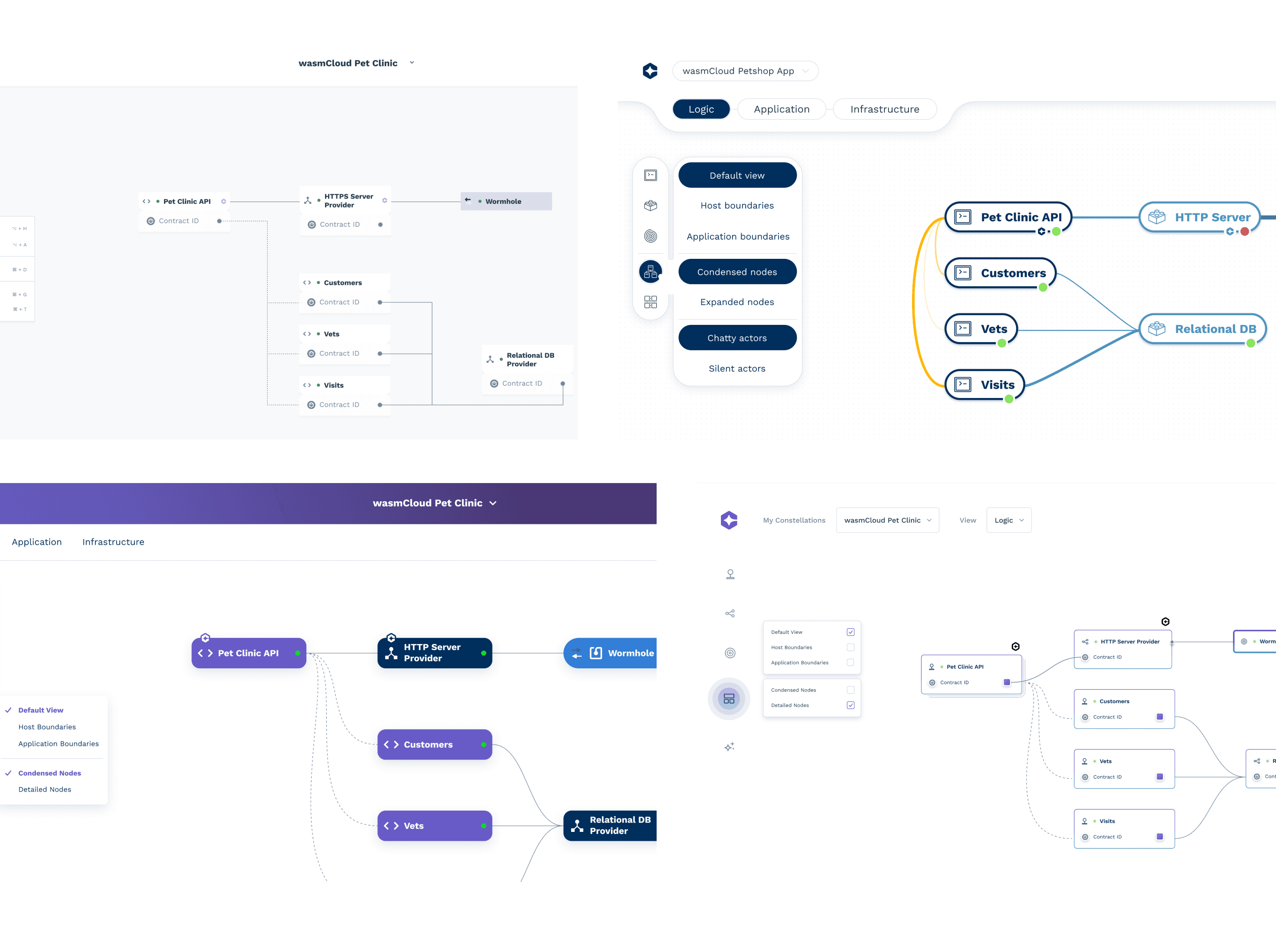
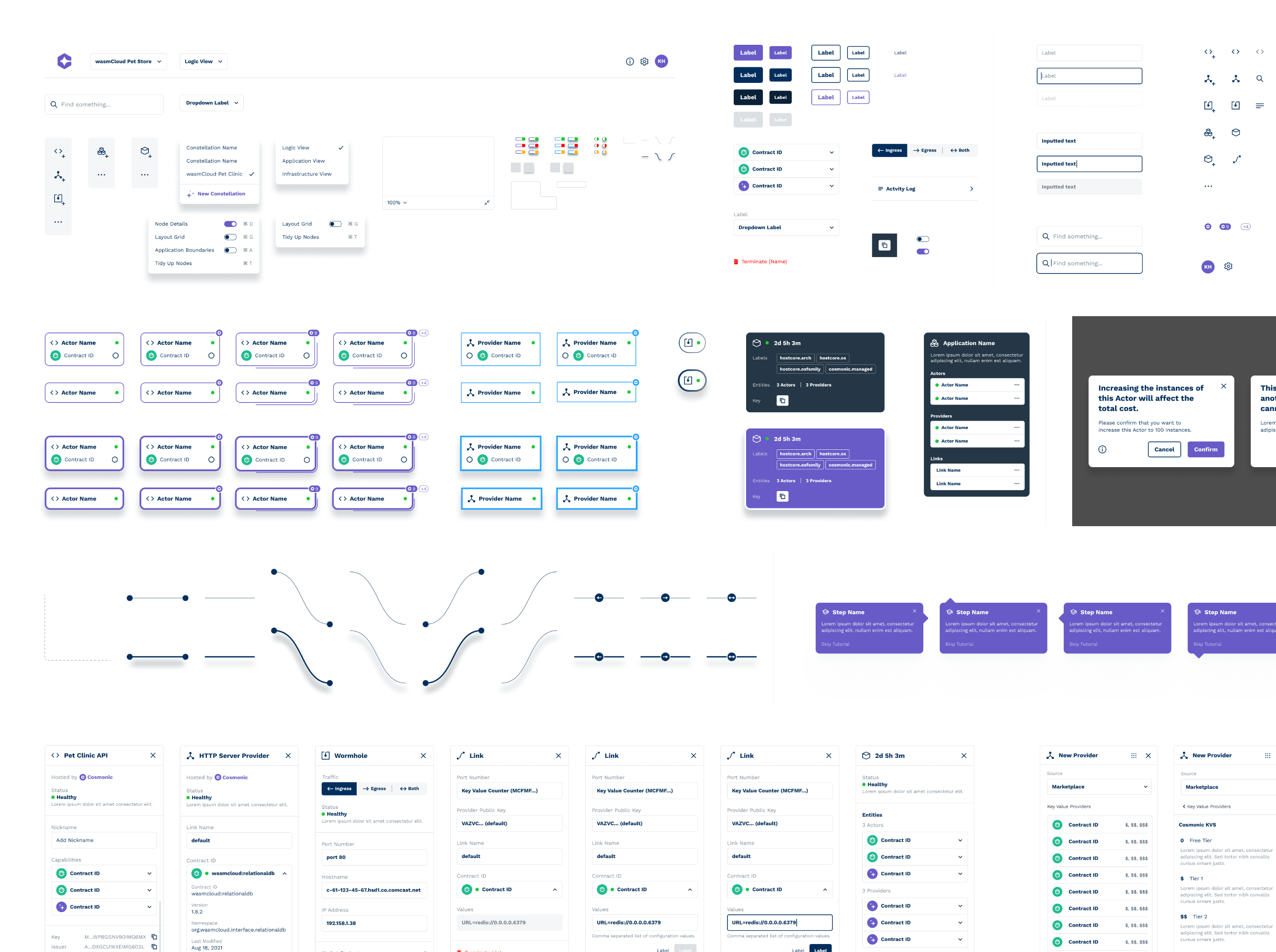
Visual Design
We refined the interaction and design language into a cohesive system. The final interface brought clarity to service-to-service relationships while scaling cleanly across different use cases.

Onboarding
This was another portion that I owned—structured onboarding experience to guide first-time users. It introduced key concepts while letting users experience the visual canvas immediately.
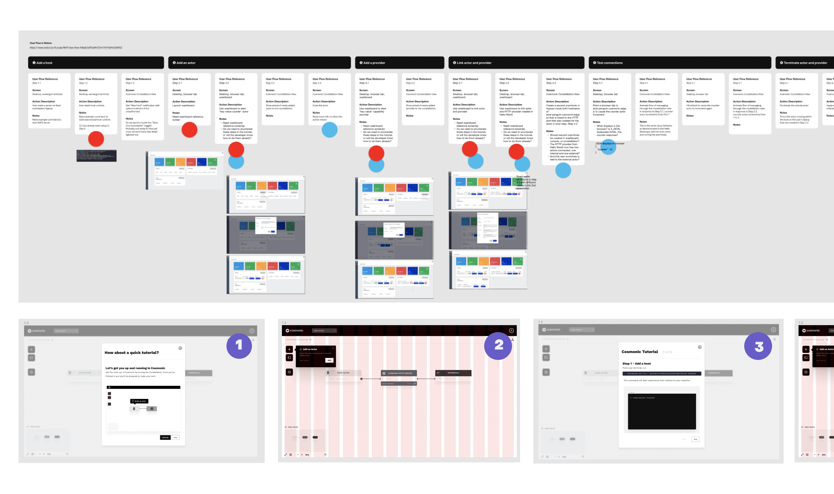
FTUX
I refined the interaction and design language into a cohesive system. The final interface brought clarity to service-to-service relationships while scaling cleanly across different use cases.
UI Kit
The team built a comprehensive UI kit to support ongoing development, including reusable components, consistent styles, and visual grammar for node-based interactions. I contributed early input, but visual design was primarily led by another designer.
The Outcome
✦ A streamlined visual editor, transforming CLI into clarity
✦ A guided onboarding experience for users of all skill levels
✦ A composable node system based on network principles
✦ A polished, modern UI system supporting future growth
“This is precisely the thing we have been driving towards over the past two years.”
-Lead developer, Cosmonic